A Fortune report claims, 75% of users never come back to a mobile app they have opened once. The numbers are indeed not in favor of any business operating in the similar domain.
So why do users abandon a mobile application after it is opened once? Is it because of the design? Or it’s the content that should be blamed? I am going to cover all this and a lot more in the write-up while talking about the best practices to enhance mobile interactions.
Let’s take it practically. What are those apps you like to visit the most? The ones whose design can be measured simply or those that confuse you even with the navigation? It’s the former absolutely.
Have you ever thought why we love to navigate through the mobile apps that do not clutter the designs for us? Simply because of their quality of designs as the navigation gets simpler for the users. When it comes to the design, the list of specifications to keep into the mind gets bigger and bigger for the designers.
Mobile apps are expected to be clear. And the ease of navigation forms an important point too. Having an intuitive interface, coupled with decent animations in a mobile app is always for the benefit of the designer as more and more users would like to navigate through such mobile applications.
The design could be such that it could guide users through the app and doesn’t make it a task for them to find the next step. For being able to design such interfaces that could prove to be one favorite to the users, follow the below-mentioned guidelines.
Before that, here are few considerations to keep into the mind. While designing, two kinds of interaction rates that are essential for every designer are.
-
Interaction rate: The interaction rate sums up the number of customers that companies are engaging with through in-app actions including mobile surveys, messages, and more.
-
Engagement rate is the average number of the users who take the intended actions companies send them.
Now Let’s Get Closer to the Mobile App Interactions to Follow:
1. Use Screen Technology
When people are downloading your mobile app, they wish to utilize every single feature it offers to them. Right from the bell icons to the elements under the hamburger menu, the users prefer to use all the icons with ease. If you can’t please your users with the icons, you are not inviting them towards it.
Let’s understand the same from the perspective of a user. As a user, you are most likely to browse through easy navigation. Isn’t that right? And why design such navigations that even makes the browsing difficult? Such kinds of interactions are never going to fulfill the requirements of users with a mobile app. Therefore, it is far better to design the utilities following the expectations of the users.
2. Do Include the Goodness of Learnability
Learnability stands for how easy it is for users to interact with the mobile application and how quickly he/she learns from previous experiences. The bottom line is, users are interacting or navigating through the screens only to experience the ease that comes along with the design. No one would ever like to land up in the messy cobweb of design only to get confused. So, to take a design into the minds of users the navigational experience of the app must seem different from other apps.
For example, do imply the logical navigation that every user would get and understand easily. Such kind of navigation would refer to an action that every user would take while browsing through the app. Do add iterations that seem prominent for users.
3. Add Multiple Holds
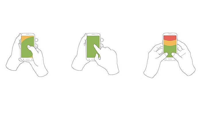
The users are different even with their ideas of holding the smartphone. The way of holding mobile phones depends significantly on the situation and the condition on which the mobile app is used. The three common types of holds include:
-
When we take the smartphone in one hand and navigate through the icons with the thumb
-
The next type is when users hold the smartphone in one hand and interact with the elements through the forefinger of another hand.
-
Another way is to hold the phone in both of the hands and use both the thumbs to interact with the icons.

While designing any of the interactions, the designers must keep the holds appropriate for every user, so that users could easily interact with the same. The tap areas should be such that users could easily reach it without much of the effort. Design the interactive elements big enough so there won’t be any chance of mistyping by the users.
4. Don’t Forget to Include Recognition Pattern
Recognition patterns are those with whom the users already strike familiarities. For example, while browsing through an e-commerce website, you may notice certain pop-ups that urge you to add the item in your cart. These are recognition patterns that may impulse the users to have the product in the cart. This is a way for the developers to add to the popularity of their mobile apps. Users quickly become accustomed to the things they see the most. The absence of these elements may feel uncomfortable for them.
Placing CTA buttons at the right interval would also push the users towards buying an item but these buttons need to be recognizable enough for users. So, working around the designs is very much important for UI/UX designers. The more the design is visually appealing the more it has the capacity of attracting the users.
5. Do Not Increase the Number of Actions for the Users
Many of the users have the experience of browsing through annoying apps that make it quite difficult for them to accomplish even an easier job. An ineffective interaction system is to blame for it. No user would like to return to an app that is making it difficult for them to accomplish any of the actions.
The sole purpose of a mobile application must always revolve around solving the problems of the users and not adding more to it. Ergonomic designs are thus an important part of the design for all the UI/UX Designers.
This means mobile apps must serve the users precisely for every type of concern even if it is about landing to a piece of information either of the website or on an app. Designs must flow effortlessly for the users. So, employ a minimum of actions so that reaching the point may seem easier for the users.

6. Give Enough Time for Testing
As I have explained earlier, mobile interactions are there to guide the users towards the predefined directions. And to identify the flaws well before the time, it is important to have usability testing for the app you have designed. It is essential to test the app for a potential audience so that they could not find difficulty while browsing through the same. Such testing is generally done at the UX stage and forms an important part of overall testing.
Usability testing allows bug identification as well as resolving the same at the earliest stage so that the users won’t find them later while using any of the applications. Ensuring testing and fixing the bugs at an early stage is important for the success of every application that developers must follow.
The Upshot
All the above-explained elements are as important as, offering a new service to the users. And while hosting your users, do keep in mind to serve them the best. Users are never going to encourage something they don’t feel comfortable to use. So, it is vital to design icons to suit the requirements of the users and for that, you need to follow the latest UI design trends and guidelines.

Sr. Content Strategist
Meet Manish Chandra Srivastava, the Strategic Content Architect & Marketing Guru who turns brands into legends. Armed with a Masters in Mass Communication (2015-17), Manish has dazzled giants like Collegedunia, Embibe, and Archies. His work is spotlighted on Hackernoon, Gamasutra, and Elearning Industry.
Beyond the writer’s block, Manish is often found distracted by movies, video games, AI, and other such nerdy stuff. But the point remains, If you need your brand to shine, Manish is who you need.


