SENLA
Software Engineering Laboratory

Software Engineering Laboratory

Updated UX/UI for data management improves efficiency and decision-making
Sanofi struggled with an old, clunky system that made managing data and medicine distribution hard. It mixed different outdated styles and scattered functions across Salesforce, Excel, and other systems, slowing down processes. To serve their employees better, Sanofi wanted to modernize the visual style, make the system user-friendly, and consolidate it into a single platform.
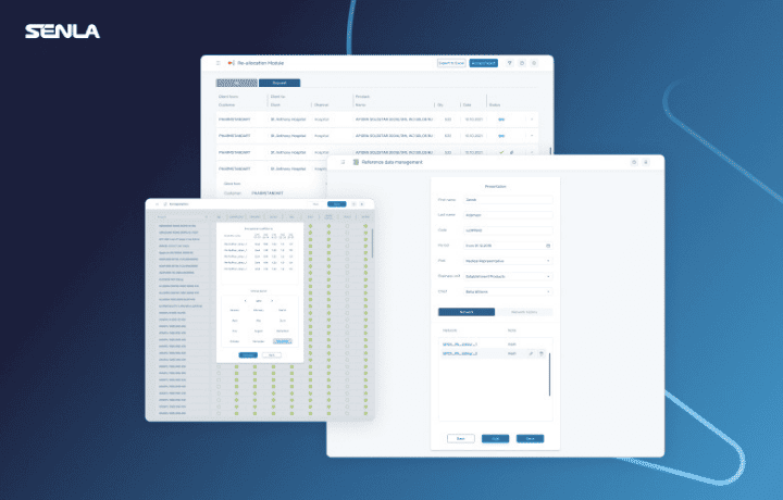
The system we worked on included various modules for managing pharmacy-related activities. Eventually, over the two years of our partnership, we designed about 20 subsystems. SENLA revamped Sanofi's UX/UI, transforming an outdated system into a cohesive, engaging platform. By interviewing users, establishing a common style, and working closely with Sanofi's team, we improved both efficiency and user experience.
Sanofi's new UX/UI design makes its data management system easier to use and look great, enhancing employee productivity and speeding up decisions. It cuts down on errors and strengthens partnerships, ensuring medicines reach consumers on time.

